
Four Premium Cover Stocks Worth Knowing, and What Each One Actually Does
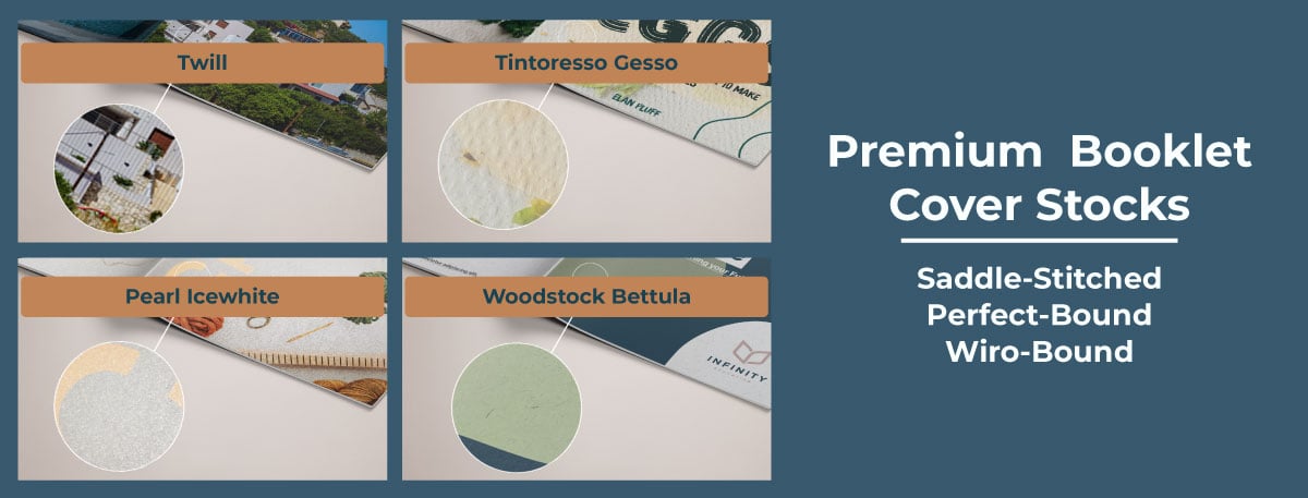
Premium Booklet Cover Stocks
Pick up two booklets. One has a standard gloss cover. The other has something with a bit of texture to it, maybe a slight shimmer, or a surface that feels more like fabric than paper. Which one do you hold onto for longer? Which one do you flick back to on a shelf?
That's the whole argument for premium cover stocks in one gesture. Before anyone reads a word of your booklet, catalogue, or brochure, they've already touched the cover and formed an opinion. Paper choice is doing marketing work whether you've thought about it or not.
Here's a look at four premium options worth considering, and what each one actually brings to the table. None of these cover stocks require lamination, as the finish speaks for itself.
1. Tintoretto Gesso: the understated one
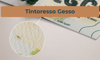
Tintoretto Gesso has a laid, almost fabric-like texture that you notice the moment your fingers run across it. It's uncoated, so there's no shine, just a warm, off-white tone (gesso means plaster in Italian, which gives you a sense of the colour) and a surface that feels considered rather than mass-produced.
This is the stock for projects where you want quality to feel quiet rather than shouted. Poetry collections, art books, architecture and design studio portfolios, boutique hotel or restaurant brand books and menus for hospitality brands wanting warmth over corporate gloss, heritage and craft brand catalogues such as distilleries, tailors, jewellers, artisan food and drink brands leaning on provenance. Anything where the goal is to feel crafted rather than corporate. At 250gsm, it's substantial enough to stand alone without lamination.
2. Woodstock Bettula: natural, without trying too hard
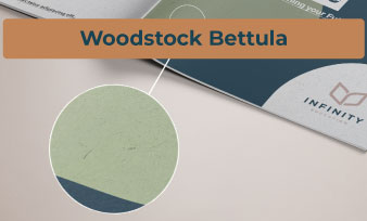
If Tintoretto Gesso is refined, Woodstock Bettula is earthy. It's part of Fedrigoni's Woodstock range, known for a soft, felt-like surface with visible fibre flecks running through it, almost like handmade paper. Bettula is Italian for birch, and the colour lives up to that name: a pale, birch-toned white that reads as natural rather than clinical.
This one suits brands leaning into sustainability, craft, or an artisanal feel. Think sustainable brand booklets, or anything where you want the paper itself to say "considered" before a single word is printed. At 260gsm it holds its shape well on its own.
3. Twill: tailored and a little bit sharp

Twill takes its name from the diagonal woven pattern you'd recognise from denim or a suit lining, and that's exactly what it looks and feels like. The texture is fine and linear, and it catches light differently depending on the angle, much like real fabric does.
This is the stock for anything wanting to feel tailored: business portfolios, luxury catalogues, or corporate booklets where you want the cover to hint at precision and quality before the reader even opens it. At 300gsm, it's the heaviest of the four, giving covers real stiffness and presence.
4. Pearl Icewhite: the one with shine
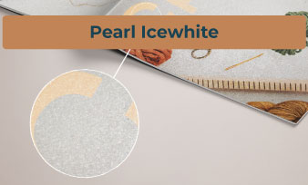
Pearl Icewhite is a different proposition altogether. Rather than texture, it's about a soft pearlescent shimmer sitting across a crisp, cool white base. Tilt it under light, and you get a gentle sparkle rather than a flat gloss finish.
This works brilliantly for anything wanting a touch of glamour: luxury retail lookbooks or seasonal collection brochures, Jewellery and luxury goods catalogues, Premium hospitality or spa brand brochures, beauty and fashion catalogues, or premium event materials. It's also 300gsm, so it feels every bit as substantial as Twill, just with a completely different personality.
So which one should you pick?
There's no universally "best" option here; it depends entirely on what you want your cover to say before anyone's read the content. These covers are available on our wiro-bound, perfect-bound, and saddle-stitched booklets. A rough rule of thumb:
- Want something quiet and refined? Tintoretto Gesso
- Want something natural and craft-led? Woodstock Bettula
- Want something sharp and tailored? Twill
- Want something with a bit of shimmer and glamour? Pearl Icewhite
The bigger point is this: paper stock isn't an afterthought you tick off at the end of a print job. It's part of the design. A cover people actually want to pick up and hold does half your marketing for you before they've even opened the first page.
If you're printing booklets, brochures, or catalogues and you're still defaulting to standard gloss because it's what you've always used, consider the difference a different cover could make. Same, same but different and more intriguing.